There is a weakness to the Twenty Seventeen Theme that we will address here.
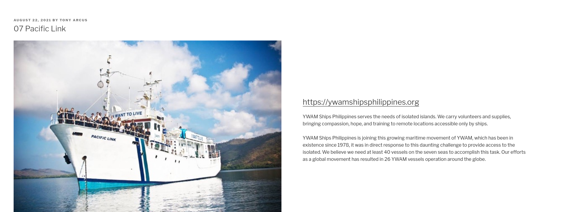
Generally, there is a lot of wasted space on Posts and Page in the left and right margins. In this example from my website https://opensourcegathering.net.nz/07-pacific-link/, you can see large margins left & right,

To overcome this we can add the following CCS code to your website.
This is one of the few times I will get you to bash some code, but it is safe and easy, I promise.
Goto Appearance -> Custimise -> Additional CSS.
This should be blank.
In to the Additional CSS box add the following:
.single-post:not(.has-sidebar) #primary,
.single-post:not(.has-sidebar) .site-content .wrap,
.page.page-one-column:not(.twentyseventeen-front-page) #primary,
.archive.page-one-column:not(.has-sidebar) .page-header,
.archive.page-one-column:not(.has-sidebar) #primary {
    max-width: none;
}

.wrap {
/* margin-left: auto; */
/* margin-right: auto; */
max-width: 80%;
/* padding-left: 2em; */
/* padding-right: 2em; */
}
/*For Content*/
.has-sidebar:not(.error404) #primary {
width: 70%;
}
/*set the sidebar width and alignment*/
.has-sidebar #secondary {
width: 25% !important;
float: right;
}

@media screen and (min-width: 48em) {
.wrap {
max-width: 80%;
/* padding-left: 3em; */
/* padding-right: 3em; */
}
}

.page.page-one-column:not(.twentyseventeen-front-page) #primary {
/*margin-left: auto;*/
/*margin-right: auto;*/
max-width: 80%;
}

@media screen and (min-width: 30em) {
.page-one-column .panel-content .wrap
{
max-width: 80%;
}
}

.has-sidebar #secondary {
width: 26% !important;
}

.site-info { display: none; }

.et_pb_map_container .gm-style-iw-d {
    background: white !important;
	padding:20px !important;
	border-radius: 10px !important;
	overflow: hidden !important;
}

Click on Publish to save. Now that page looks like this: